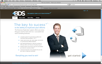
 It was great to create a brand for BDS. They needed a color scheme and a logo and a look and a lot of stuff.
 We chose brown for their main color because it was rich, earthy and tied into the color scheme of their parent site (mygurusystem.com). Bright blue represents power and business, to me. The bright blue and Chocolate brown sensation is
one of my very favorites.
Recently I have been trying to stray away from doing so many initial logos; like if your company is called "Tony's Truck Land", it's logo would be like a big TTL, etc. I have been trying to stay away from those because they are just so common, but BDS just screamed out at me - "HEY! DO THE INITIALS!" so I had to obey the voices in my mind. The stack of papers represents the point of the business, which is to duplicate what you have already made, and make it work for you. I strove to find a simple way to represent the word "duplicate".
My favorite aspect, however is the plus signs. That type of simple cross symbol really draws the eye, and the electric blue helps out as well. The symbol is a plus sign, representing duplication (addition) of your work. The plus sign signifies the ability to make a copy of somthing as if you were living inside of some software.


