 It's coming along . . .

Friday, October 22, 2010

Wednesday, October 13, 2010
Meal Choices . . .


Oh the choices for the logo of meal choices . . . which one should we choose? Sandy's kitchen hired us to revamp their "
other" site. An exciting re haul ahead. (In the conceptual stages).
Green is deffinetly the main color - it is on the original site and it acurately portrays healthy and organic

foods (PLUS it is my favorite color). Not sure what to use as the ICON of this company. But We will continue to work on it.
Business continues to run awesomely. We are currently working for multiple clients on new, fun and exciting projects!
This is the original site . . . and we will make it somthing to be proud of.
Monday, October 4, 2010
I LOVE PRINITNG STUFF
There is an amazing difference when your designs come out of the metal confines of the imaginary world of 1s and 0s in your computer's hardware and graduates into full RGB 11X17 printed GLORY! This week we have been printing and implementing lots of our ideas and dreams into tangible reality. Normally VADA has done purely web work and it is fun to see our work in the real world!

 After that we printed decorations for the BYU chinese flagship tutorial labs. They were a fun concept to see come into reality. This involved:
This month we printed our brand new business cards. They are the coolest thing in the world . . . because they are floating text! THEY ARE TRANSPARENT! BOOOM! yes! This is a long time dream for us that has been realized!
After that we printed decorations for the BYU chinese flagship tutorial labs. They were a fun concept to see come into reality. This involved:1. Scissors
2. Rubber cement
3. exacto knifes
4. foam board
5. Adhesive putty
6. glue stick
7. time
The end result is an inviting lab for all the attendants!
After that . . . we printed some posters for the SIGMA EPSILON guys and got to see them in real life too!
Wednesday, September 22, 2010
Designing for BDS
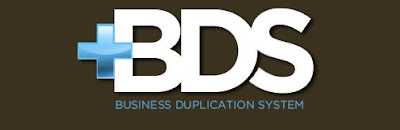
 It was great to create a brand for BDS. They needed a color scheme and a logo and a look and a lot of stuff.
We chose brown for their main color because it was rich, earthy and tied into the color scheme of their parent site (mygurusystem.com). Bright blue represents power and business, to me. The bright blue and Chocolate brown sensation is
one of my very favorites.
Recently I have been trying to stray away from doing so many initial logos; like if your company is called "Tony's Truck Land", it's logo would be like a big TTL, etc. I have been trying to stay away from those because they are just so common, but BDS just screamed out at me - "HEY! DO THE INITIALS!" so I had to obey the voices in my mind. The stack of papers represents the point of the business, which is to duplicate what you have already made, and make it work for you. I strove to find a simple way to represent the word "duplicate".
My favorite aspect, however is the plus signs. That type of simple cross symbol really draws the eye, and the electric blue helps out as well. The symbol is a plus sign, representing duplication (addition) of your work. The plus sign signifies the ability to make a copy of somthing as if you were living inside of some software.
Monday, September 20, 2010
SANDY'S KITCHEN WEBSITE COMPLETE!

Finally our creation is alive! Go and check it out at http://www.sandyskitchen.net
give us feed back by letting us know what you think. You can write on our facebook wall or email us at info@vadastudio.com
This was a great project because it involved giving an existing brand and website a facelift . . . wait no more like TOTAL BODY RECONSTRUCTIVE SURGERY. Starting from the ground up we wanted to give Sandy's Kitchen a friendly personal feel, that was not too stuffy and corporate. We wanted to walk the line between homey & approachable but professional and high end. We accomplished this by using a softer color palate, that was mild to digest and easy to look at - but very vibrant and fun.
It was wonderful to give this site to Sandy and her Catering business, because her food and her services are awesome, and her old website was not really portraying that. Her new website, in our opinion, more accurately represents how professional she really is!
On this project we collaborated with a new friend. A photographer named Meredith Rodgers did most of the shots in the site. Her photography added a vibrance and life to the pages. We look forward to working with her more in the future. Her photography is SWEET!
More to come from VADA creative studio. Stay updated.
Friday, September 17, 2010
TO DO LIFE
The best problem I can have as a designer is to have too much to do! That is about 300% better than having not enough to do!


This month of september, our studio has been swamped (in the most positive sense possible) with exciting and new projects to do! We are currently pumping out:
1. Sandy's Kitchen's Catering Site
2. Animated banner for LendingWebsites.com
3. Website for Awkward Robot Design
4. Concept for Play Theory Web and Branding
5. Add campaign for BYU Chinese Flagship Program
6. Music for Traveling Books
7. Branding for Business Duplicator
8. Web and Branding for Chance Carter "The Last Desperado"
9. Poster for Sigma Phi Delta
10. Shapes Places and Spaces art installation
11. Racica Branding and Web design
Anyways I am sure that the list goes on! But it is exciting to have so much to do! VADA forever!
Friday, August 27, 2010
PrPace.com or something like that

We were hired to put together the graphic end of a runners log blog website thing . . . they are still coming up with a name but it sounds like a cool concept. Here is our first concept for their logo:
More to come! Stay tuned to the VADA channel.
Subscribe to:
Posts (Atom)